Diversity and inclusiveness are core requirements when developing a modern software solution. No matter their age, languages spoken, geographical location, and physical and technical abilities/limitations, users expect products to be accessible. Thus, ensuring the basic level of accessibility and inclusivity when designing a product’s user interface and user experience (UI/UX) is a must.
Major companies including Microsoft, Apple, and Google create their products based on inclusive design principles. The number of lawsuits filed against inaccessible websites and applications is on the rise, proving that ensuring inclusivity and accessibility is not a trend but rather a necessity for today’s businesses.
In this article, Apriorit experts discuss why accessibility is important in UX and UI design and explore the basics of inclusive design and software accessibility. We also overview the key benefits of building inclusive products as well as UI/UX design accessibility issues you may expect along the way.
This article will be useful to technical leaders and development teams wanting to improve the inclusiveness of their products. To make this journey a bit easier for you, Apriorit’s UI/UX specialists provide a software inclusivity checklist focused on four key UI elements: text, layout, media, and design. With this checklist, you can effectively evaluate your product’s current inclusiveness and plan further improvements.
Contents:
- Inclusive design in software development
- Understanding UI/UX limitations for various users
- Why do you need to build software with an inclusive UI/UX?
- What challenges can you expect when building an inclusive UI/UX?
- What do you need to deliver software with an inclusive UI/UX?
- Checklist for improving your product’s accessibility
- Conclusion
Inclusive design in software development
Inclusive design is a software design methodology that aims to increase product or service accessibility for users with different backgrounds and abilities. There’s a common misconception about inclusive design targeting only people with psychophysical limitations. However, inclusive design aims at ensuring software accessibility and usability based on various characteristics including a user’s age, geographic location, economic background, race, languages spoken, and so on.
Sometimes, inclusive design is also called a11y, with the number 11 referring to the number of letters in the word accessibility.
Let’s briefly overview the key terms relevant to building inclusive software:
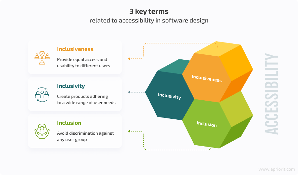
- Inclusiveness is a concept that emphasizes the idea of creating an open and welcoming environment that accommodates all individuals, regardless of their different characteristics and backgrounds.
In UI/UX design, inclusiveness means designing products and services that consider the diverse needs and abilities of different users. It also aims to provide equal access and usability to everyone.
- Inclusivity means engaging all individuals, particularly those who have been historically excluded or marginalized. It focuses on actively ensuring that all people get equal opportunities, representation, and participation, no matter their background, identity, or abilities.
In UI/UX design, inclusivity emphasizes the intentional effort to create products and services that are accessible, usable, and cater to a wide range of user needs and preferences.
- Inclusion requires encompassing all individuals, particularly those from historically excluded or underrepresented groups. Inclusion promotes a sense of belonging, respect, and equal participation for all, emphasizing the value of diversity and recognizing the unique perspectives and contributions of every individual.
In UI/UX design, inclusion highlights the importance of creating products that do not exclude or discriminate against any user group and ensure equitable access and engagement.
When talking about UI/UX design, the term inclusivity is often most appropriate. It emphasizes the ongoing practice of actively considering and addressing the diverse needs and abilities of users during the design and development process. Inclusivity in UI/UX design involves:
- Incorporating accessibility features
- Considering different users’ perspectives
- Striving for equal access and usability for all individuals
Inclusivity emphasizes the proactive effort to create an inclusive user experience, allowing people to use a specific product in a way that is accessible or convenient for them, considering their individual requirements.
Win more users with an outstanding design
Reach out to our UI/UX experts to make your product engaging and convenient!
Understanding UI/UX limitations for various users
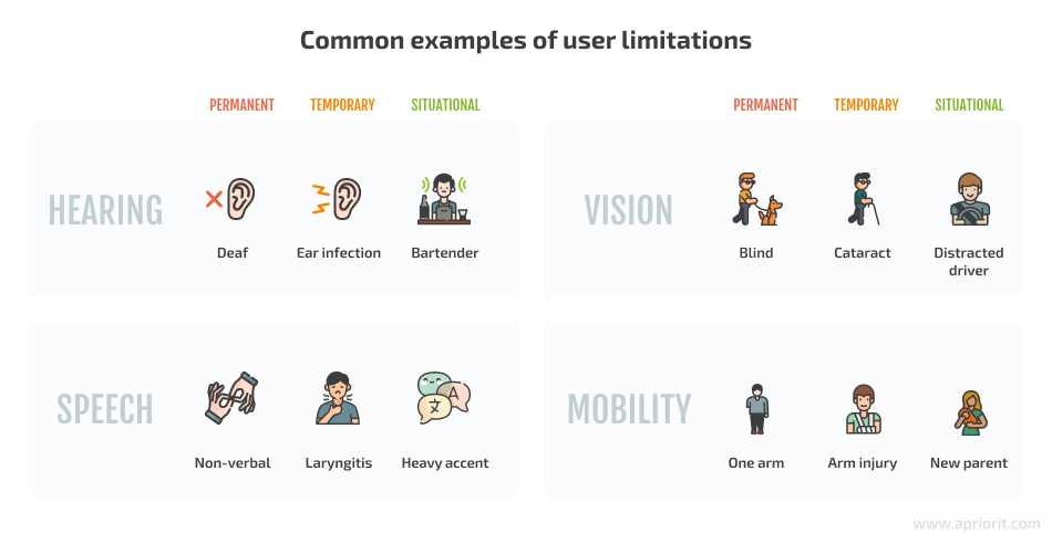
Inclusivity in UI/UX design implies that users can engage with your product or service without obstacles. However, regardless of who your product is initially intended for and how many users it serves, it’s important to realize that absolutely everyone can face limitations that may be:
- Permanent
- Temporary
- Situational
Some limitations arise from the situation: for example, trying to make an urgent call in a noisy place or read a text in an uncomfortably small font. Other limitations may come from a user’s temporary limitations, such as using a computer with a broken arm or communicating via a voice call application when you have a sore throat. Finally, there can be limitations that are permanent, such as having severe vision or hearing impairment.
The concept of accessible UX/UI design implies both perceptual and functional accessibility. To illustrate these types of accessibility, let’s take a look at some options for people with hearing impairments:
- Perceptual accessibility is when people with hearing impairments can still watch movies and videos with subtitles on.
- Functional accessibility is when people with hearing impairments can use a chat instead of calling a hotline.
Graphics in your application can become a real nightmare for a person with color blindness. But colors can also be distorted for any other user due to poor screen brightness or filters, such as a blue light filter or night mode turned on to relieve eye strain.
Let’s overview some common accessibility considerations in the UX design and UI of software solutions:
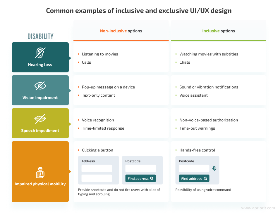
By taking into account various psychophysical limitations, you can design software that is accessible not only for people with permanent limitations but also for those who have temporary limitations or specific preferences for software use.
However, it’s also important to take into account possible age-related limitations, especially for elderly users. Aging can affect core physical abilities — hearing, vision, speech, and mobility — as well as mental capabilities. And with an aging global population, there’s a definite need to account for senior users when building competitive software.
By 2050, the number of persons aged 65 years or over worldwide is projected to be more than twice the number of children under age 5 and about the same as the number of children under age 12.
United Nations’ World Population Prospects 2022
In practice, there is even a concept called the grandma test, which sets the task of finding out if your product is accessible for elderly people and if they can understand how it works.
Note that while inclusive design aims to prevent inconveniences that your users may experience, it doesn’t require you to build a universal solution that suits absolutely everyone. Therefore, when solving the problem of one category of users, you need to stay focused on achieving the main goal of your product and meeting the needs of its main target audience first. Only then will you be able to get the maximum benefits from investing your resources in the development of an inclusive product.
But what are those benefits? Let’s dive into the reasons behind the importance of accessibility in UX design.
Read also
4 Stages of Responsive Web App Development
Discover the benefits of responsive web applications. Explore our practical guide to make your app perform flawlessly across all devices.
Why do you need to build software with an inclusive UI/UX?
The time and effort required for planning and delivering an inclusive solution are often cited as arguments against creating an accessible UI/UX. However, this investment pays off in many ways.
The reasons for implementing accessibility in UX/UI design can be roughly divided into two categories:
- Business benefits
- Social benefits
Let’s start our overview with business benefits.
Business benefits of an inclusive UI/UX design
We can outline six core benefits of building your software and services with accessibility in mind:
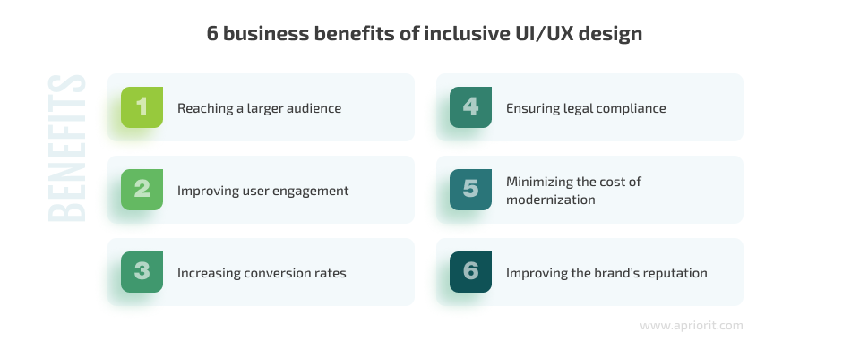
1. Reaching a larger audience — Inclusive software design allows software providers to tap into a diverse market of users, catering to their specific needs and expanding the user base. It also accommodates the needs of aging populations, non-native speakers, and users with diverse preferences, making software more inclusive and appealing to a wider range of individuals.
2. Improving user engagement— A difficult-to-use application with an inaccessible and unintuitive interface can turn away users, even if the application has necessary functionality for solving certain tasks. Moreover, the way your product is designed may not allow your users to understand how to use it. On the other hand, a simple and understandable application is desirable and increases user engagement.
3. Increasing conversion rates — Inclusive design allows your visitors to easily find the information or services they’re looking for and thus convert from visitors into clients. And with 61% of service websites and apps being unusable for people with disabilities, taking accessibility into account can provide you with a significant competitive advantage.
4. Ensuring legal compliance — By building inclusive software that meets local and international accessibility requirements, you can avoid legal disputes related to non-compliance and reduce the risk of discrimination claims against your business. Many countries have laws and regulations that require businesses to provide accessible technology and services to people with disabilities, like the Americans with Disabilities Act Amendments Act in the US or the Equality Act in the UK. There are also universal recommendations, such as the Web Content Accessibility Guidelines (WCAG).
5. Minimizing the cost of modernization — Accessibility is a legal requirement that needs to be implemented in digital products. It’s always less expensive and more effective to build an inclusive UI/UX from scratch than to tack on accessibility later and do the same work twice by modifying a finished product. In addition, modernizing a finished product without changing the approach to design can create new accessibility problems, and solving them will add to the final product cost.
6. Improving the brand’s reputation — If your users are convinced that your product is simple, understandable, and accessible, they will choose it and will look forward to trying out your new products. Showing commitment to improving your products and services with an accessibility-focused mindset creates a positive image for your brand.
Simplicity, clarity, and accessibility also affect confidentiality and security. If a user needs help understanding your product, filling out a form will be difficult, and they will have to ask someone for help. But if users don’t have to rely on outside help while using your product, then trust and love for you and your product will grow.
Now, let’s look closer at some social benefits of taking an accessibility-first approach to UI/UX design.
Read also
Benefits and Risks of Outsourcing Engineering Services
Optimize costs, enhance expertise, and accelerate project timelines. Take the most of IT outsourcing by knowing what advantages to expect and how to address common concerns.
Social benefits
Inclusiveness stimulates the search for new solutions and new ways of using existing technologies that may not be widespread or that may seem irrelevant. For example, adjusting screen brightness was initially seen as important only for people with weak vision. However, as the need arose for reading information on a phone screen in bright sunlight, this feature turned out to be helpful to the majority of mobile phone users. Today’s smartphones can automatically adjust screen brightness depending on the lighting for ease of reading.
Building accessible software also brings meaningful social benefits:

1. A safe and environmentally friendly service or product — Inclusive software design can prioritize user well-being by considering factors such as reducing eye strain, offering options for shortening screen time, and promoting a healthy balance between digital interaction and real-world engagement. Inclusive software helps to create a safe and environmentally friendly service or product that minimizes harm to users’ health and life.
2. New communication opportunities — Technologies can create barriers to social participation and increase the exclusion of some groups from society. Inclusive products, on the other hand, can allow people to be part of society and feel seen. They can also enable people with communication difficulties caused by abilities or developmental characteristics to interact through technology.
3. Global economic growth — Inclusive technologies and products can improve people’s quality of life through new educational and work opportunities that were previously unavailable to some. This might become a catalyst for future economic growth.
However, you still might encounter some challenges when improving the accessibility of your products. In the next section, we overview the most common.
What challenges can you expect when building an inclusive UI/UX?
Building an inclusive and competitive product is challenging. Based on Apriorit’s previous projects, we can outline six key challenges you should be prepared for when building an inclusive product.

1. Legal compliance — Many countries have accessibility laws and requirements for products or services distributed in their market. Moreover, designing your software according to existing accessibility requirements is not enough. You must keep up with evolving requirements and understand their applicability to different types of software and digital technologies.
2. Compatibility with assistive technologies — Most necessary assistive functionality is already implemented in devices, operating systems, and web browsers, so you don’t have to design multiple additional interfaces for your product. What you need to focus on is building software that is compatible with existing assistive technologies and tools used by people with disabilities: screen readers, magnifiers, keyboard navigation, and so on.
3. Safety considerations — Ensuring that software doesn’t pose risks to the health or well-being of users with disabilities is crucial. This includes avoiding elements that could trigger seizures, considering the impact of animations or visual stimuli, and creating a safe environment for all users.
4. Awareness and understanding — Overcoming myths and stereotypes surrounding inclusive design is important. Some people may view inclusive design as complex, specialized, or unnecessary, leading to misconceptions and resistance to implementing accessible interfaces. Increasing awareness and understanding of inclusive design principles and available tools is essential.
5. Inclusivity within limited access projects — While not all projects may be legally obligated to be inclusive, it’s important to consider potential difficulties and inconveniences that your users may face. Balancing accessibility and project constraints requires careful decision-making. Even when you build a solution for internal or limited use, it’s important to provide the same accessibility and usability options to all users.
6. Design complexity — While many accessibility features can be implemented through standard settings and practices, certain inclusive products may require specialized and complex design considerations. These could include applications with speech translation into sign language or programs for reading text aloud.
But what should you do first when you decide to build an inclusive product? Let’s go over some key aspects in the next section.
Read also
Requirements Elicitation: Reasons, Stages, Techniques, and Challenges
Learn how effective requirements gathering can shape project success, minimize risks, and streamline development. Discover key techniques for refining your project vision and setting a strong foundation from the start.

What do you need to deliver software with an inclusive UI/UX?
The initial and most difficult task in planning a product’s accessibility improvement strategy will be identifying key priorities:
- What goal does the user have in mind when using the product?
- Should the product be universal and cover as many users as possible, or should it focus on overcoming difficulties in use for a certain group of people?
- To what extent should your product meet (or does your product already meet) the Web Content Accessibility Guidelines?
- Which Web Content Accessibility Guidelines should be met by specific parts of your service or solution (website, mobile or desktop application, or administrative software)?
- What potential or existing problems and factors affecting the user experience might your users encounter?
- Do you plan to gather an in-house team or outsource the design to external specialists to ensure compliance with established requirements?
Answering these questions will help you plan your strategy, set your priorities, and identify the main pain points to address. The next step is to create a detailed description of the accessibility standards your company adheres to. These should be taken into account by both the development and quality assurance teams working on your product.
Depending on whether you build a product from scratch or improve the inclusiveness of an existing solution, you might need to take a different approach to project planning.
In the case of a brand-new product, accessibility principles should form the foundation of your project. To enhance the inclusiveness of an existing product, start by auditing the product’s current WCAG compliance.
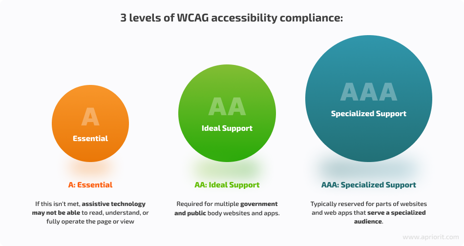
According to WCAG, there are three levels of accessibility (conformance) requirements, reflecting the priority of support:
To properly organize all processes, whether you’re building an inclusive product from scratch or improving the accessibility of an existing project, the main requirement is to enhance your team with a special set of knowledge and skills. From Apriorit’s experience, the average team needed for building an inclusive product includes the following roles:

A developer should have skills such as semantic markup, including the basics of inclusivity, as well as an understanding of and practical experience with Web Accessibility Initiative – Accessible Rich Internet Applications Suite (WAI-ARIA) patterns for implementing accessibility solutions through built-in assistive technologies.
A UX specialist can be a UX designer or a team consisting of a business analyst and a designer. UX specialists should be able to apply an inclusive approach to conducting analysis, building hypotheses, and designing software interfaces based on a style guide covering the code requirements of relevant accessibility standards.
A QA specialist or team should be familiar with WCAG 2.0 AA standards to check the compliance of product or website accessibility with relevant norms through manual and automated testing.
A marketing specialist should be able to analyze and identify the impact of changes related to the implementation of an inclusive approach and assist in the development of effective guidelines.
A project manager (PM) will lead the project processes and ensure the precise execution of assigned tasks. Your PM must be aware of all guidelines, principles, and accessibility standards used in the project.
Now that you have the vision of a competent team for building inclusive software and implementing basic principles of accessibility, it’s time to learn how you can evaluate the inclusivity of your product or service. In the next section, we provide you with a detailed checklist for software accessibility as well as some inclusive UX design examples.
Related project
Building a Microservices SaaS Solution for Property Management
Discover how Apriorit rebuilt the architecture for a leading US-based property management software provider. This modernization led to enhanced flexibility, scalability, and cost-effective maintenance, supporting seamless expansion and future growth.
Checklist for improving your product’s accessibility
Based on generally applied accessibility standards, practices used in global companies, and our 20+ years of experience building inclusive and secure software, we at Apriorit have prepared a basic checklist covering the core needs of AA and AAA categories according to WCAG. We didn’t add requirements for the A category to this checklist, as they are present in the majority of modern solutions.
This checklist only covers the key points to consider when implementing an inclusive design approach and can serve as a starting point for evaluating your project’s inclusivity.
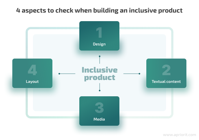
Let’s start with the key aspects of planning the design of your product or service.
Design
Finally, here are some core recommendations to take into account when working on your product’s design accessibility:
- Always remember about adaptability when developing web interfaces. Also, consider devices with small screen resolutions in the design process (for example, using Figma Mirror) and during direct testing.
- Avoid placing clickable elements too close together for mobile interactions — the standard minimum object size for tapping is 48×48 px or 48×48 dp.
- When building a mobile interface, don’t forget about blind spots on mobile screens:
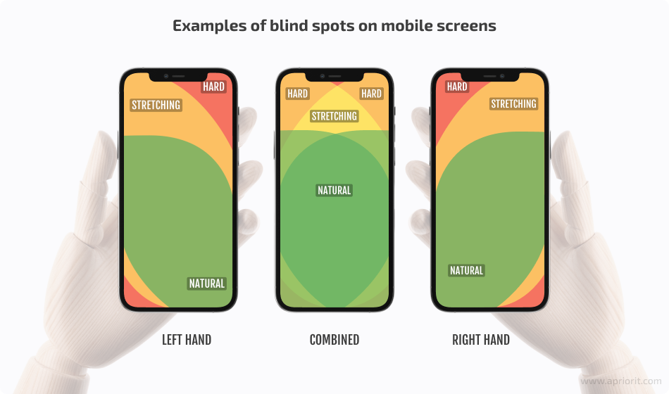
- The location of all interactive elements should be in the green zone to ensure comfortable one-handed use of the page or application.
- Typographic elements should be readable: text and headings should be large enough, and characters should be easily distinguishable in the font used.
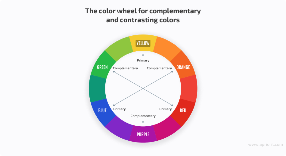
- Use contrasting colors in the interface (or complementary colors that are opposite each other on the color wheel).
- All elements on the page (including text, links, and icons) should be sufficiently clear and distinguishable for people with visual impairments or color blindness. To check the contrast ratio, you can use online services such as Contrast ratio or WebAIM as well as plugins like A11y for Figma. You can use these tools even in the design system and interface development stages, which can help you fix design issues and improve the interface’s perception early on.
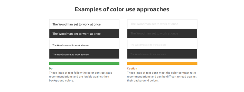
- Limit the use of pure colors (including pure white #ffffff and pure black #000000), as they might be irritating to some users. Pure colors are better used when you need to draw the user’s attention to something, such as call-to-action buttons or error messages, or as an accent on the page.
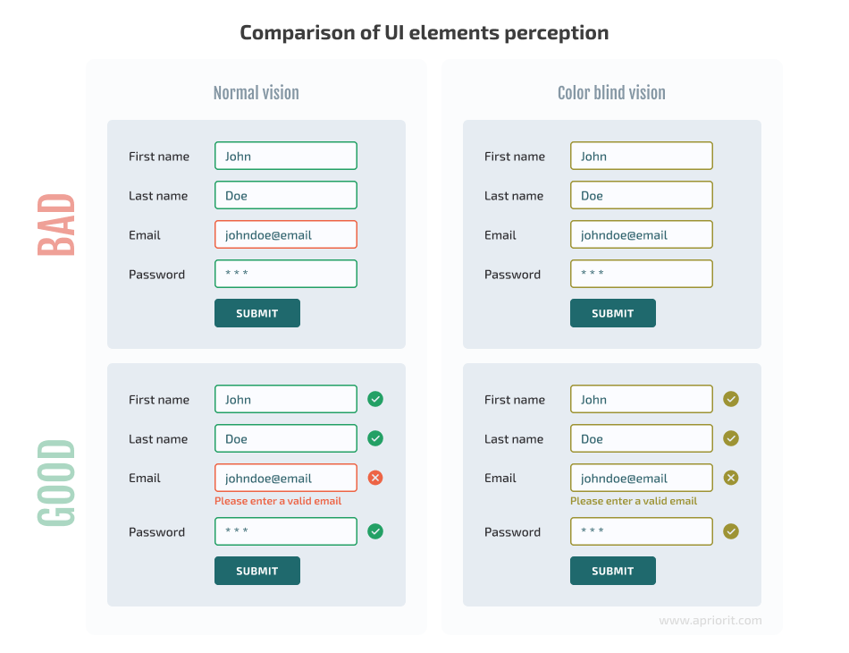
- Choose subdued colors for the base. Don’t use color as the only indicator of an error. Add symbols that will help color-blind users detect and fix the error.
- Use hints, placeholders, and descriptions to provide additional information to the user.
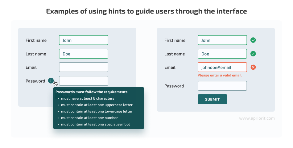
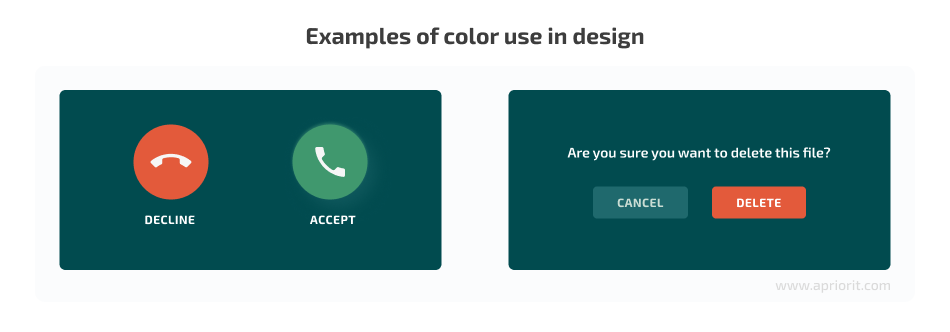
- Use appropriate contrasting colors to distinguish positive and negative events or actions — such as the widely used and recognized pair of green and red. Color can be used to guide the user through the interface.
Next, let’s take a look at the text you use across your software.
Related project
Developing and Supporting a CRM System for a Medical Transportation Company
Discover how Apriorit improved the security of our client’s existing solution, perfected the user interface, refined legacy code, and created new CRM modules to drive user experience!
Textual content
When working on website or application content, take into account the following recommendations:
- Use simple language without jargon, complex metaphors, or overloaded terminology. This way, you’ll make the text accessible for a broad audience.
- Balance text with graphics such as photos, icons, and diagrams to make it easier for users to understand the content, analyze information, and make decisions.
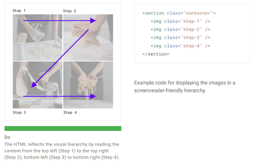
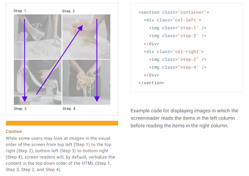
- Adhere to a clear and logical hierarchy in the placement of content on the screen and avoid complex structures such as menus, tabs, information blocks, and cards to avoid confusing the user. This will also help you ensure faster and easier navigation for those who use a screen reader to reproduce content.
Take into account that users might process the information on a web page in different patterns. Depending on the pattern you choose, you may need to adjust the HTML representation of your content. For example, you can place different items to be perceived from left to right:
Or, you can choose to format your content to be perceived from the upside down:
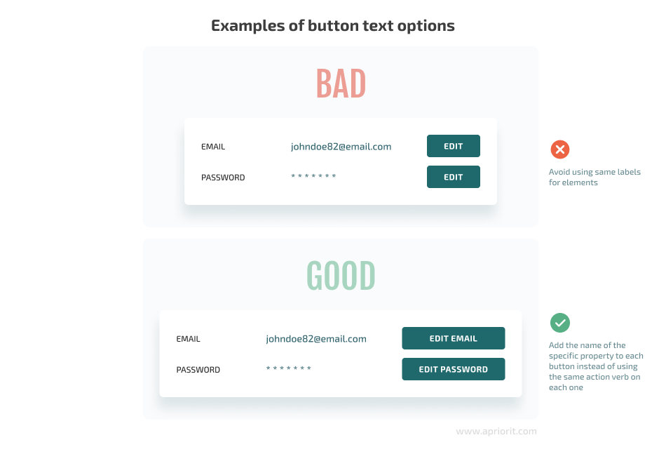
- Buttons, links, labels, and forms should clearly communicate to the user what will happen when they interact with them or what is required of them. Also, take into account that some users use a list of elements to navigate the screen, so similar and non-specific labels can be confusing. For example, with buttons that allow the user to edit some field, it’s best to add the name of the specific field that each button allows the user to edit instead of using the same phrase (such as “Edit”) on each button.
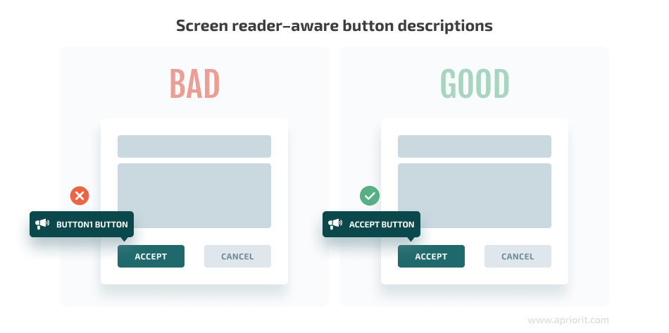
- Another thing to take into account are descriptions of functional elements on your page, like buttons, as they will be read by screen-reading tools to help users navigate the page.
- Providing multilingual support will help users easily navigate the interface using the most convenient language for them.
- Use left-to-right or right-to-left text orientation as appropriate for the given language.
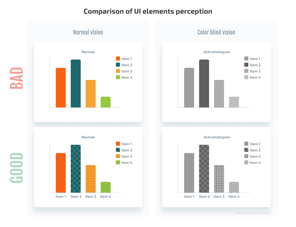
- When creating graphics and diagrams, check if all their components are clearly distinguishable in black and white. If they are not, add patterns and/or label each element. This is necessary not only for black-and-white printing but also for people with color blindness.
Layout
When examining your product’s layout, pay special attention to the use of assistive tools and technologies along with the following recommendations:
- Use header, footer, main, section, nav, and aside semantic tags, also known as ARIA Landmarks (WAI-ARIA), to help a user quickly move to the desired element on the page.
- Validate your code to ensure accurate cross-browser display and support for assistive technologies (AT).
- Use detailed headings in the title element — if assistive technologies are used, this will make it easier for a user to orient themselves on the website.
- Maintain the correct order of tag depth for presenting content on the page (from H1 to H4, without skipping levels). Make sure there is only one H1 heading on the page.
- Maintain the correct structure of tables and forms to enable logical movement within elements using assistive technologies.
- Apply ARIA Roles attributes to indicate important interface elements that should not be skipped by a screen reader or other assistive technology when navigating the screen.
- Apply alt attributes to images and use AI technologies for image recognition and alt description generation.
- Optimize your code to ensure fast loading of web pages or applications and thus minimize the load on the user’s internet connection and system memory.
- Avoid horizontal scrolling.
- Account for different screen options (mobile phones, tablets, etc.) when designing the page layout to ensure easy navigation and use of links and buttons on various screens.
Media content
When adding media content to your product — images, video, audio, and so on — make sure to follow these recommendations:
- Ensure proper use of alt tags: for all images that supplement content, add an alt tag with a detailed description.
- If an image is part of a decorative design element, an alt tag is not needed.
- Use alternative detailed descriptions for images and diagrams. If they contain text, that text should be duplicated in the alternative description.
- Place captions for images.
- When adding images, consider the device orientation in both portrait and landscape modes.
- For videos, consider adding subtitles or text dubbing.
- Avoid using bright flashes and flickering animations in videos.
- Add warnings about flickering animations or flashes if you decide to use them on your page.
Taking into account all of these recommendations, you can ensure a basic level of accessibility and inclusivity for your product.
Conclusion
It’s hard to underestimate the importance of accessibility in UX/UI design. Modern software solutions and web services need to adhere to high accessibility standards in order to meet the needs of a diverse audience, comply with legal requirements, and stay ahead of competitors. While it’s best to build your products with accessibility in mind, it’s also possible to improve the inclusivity of the UI/UX for existing products.
When examining accessibility in UX/UI design, take into account both local and international standards, regulations, and guidelines, focusing on four core elements: text, media, layout, and design.
At Apriorit, we have over 20 years of experience delivering secure, performant, and accessible solutions built with diversity in mind. Our team of highly qualified business analysts and designers can help you create a brand-new inclusive product or build a strategy for improving the accessibility of an existing service or solution.
Need outstanding UI/UX design?
Let’s create a functional interface for your users to make you stand out from the competition!


